 |
| TrackPoint on a Lenovo Thinkpad |
Tuesday, November 16, 2010
Bring back the TrackPoint
The TrackPoint that I'm referring to is that red pointing stick that used to be commonly found on IBM (now Lenovo) laptops.
The advantages of the TrackPoint over the touch pad are very apparent after using the TrackPoint for a small period of time. First of all the TrackPoint is located in the middle of the keyboard, surrounded by the B, G, and H keys. This allows the user to type much faster and use the computer more efficiently as the user's keys never have to leave the home row. Another advantage of this design is that it affords a smaller and sleeker laptop design as the pointing device is integrated within the keyboard. Unfortunately for reasons unbeknownst to me the TrackPoint has drastically lost popularity since its introduction in 1987. Now the only way one can purchase a laptop with this feature is by selecting a one particular model of a Lenovo laptop (Thinkpad).
Monday, November 8, 2010
Blackboard
For this blog post I will deviate from my usual topics and discuss the Blackboard Academic Suite. Blackboard is the system that Union College uses to facilitate interaction between teachers and students. The system is good in that it provides a semi-unified system where users can receive and submit information for their classes. I'm hesitant to say that the system is completely unified because not all classes use it. While this is not technically a design fault its still inconvenient to goto different systems for different classes.
 |
| Blackboard Academic Suite - Macroeconomics |
Another annoyance is the fact that the button layout is not standardized between classes. For example the above is for my macroeconomics class while this is for my econometrics class.
Wednesday, October 20, 2010
Facebook chat
One thing that has bothered me about Facebook chat was the lack of minimize and close buttons that were traditionally located in the top right of the chat window.
As shown in the picture the close and minimize buttons are missing, although you can still click in their invisible places to close and minimize. At first I assumed this was a bug localized to my computer. This assumption was invalidated when a friend came to me complaining about the same problem. I can only assume that they made this change to showcase a more aesthetic or cleaner interface but I find it a little ridiculous to change a user interface standard which has been in place for at least a decade.
As shown in the picture the close and minimize buttons are missing, although you can still click in their invisible places to close and minimize. At first I assumed this was a bug localized to my computer. This assumption was invalidated when a friend came to me complaining about the same problem. I can only assume that they made this change to showcase a more aesthetic or cleaner interface but I find it a little ridiculous to change a user interface standard which has been in place for at least a decade.
Thursday, October 14, 2010
Mouse
In keeping up with the tradition of writing about electronic devices, my next topic is my mouse. My previous mouse was a Logitech MX 310 which served me well for a good 5 years before I broke it. For my next mouse I decided to stick with logitech and buy the standard Logitech Optical USB Mouse.
I was first bothered with the fact that unlike the MX 310, this mouse didn't have buttons on the left and right side, which were convenient for going back and forward while browsing the web. It wasn't until the 3rd week of use that I noticed that there were little arrows to the left and right of the scroll wheel, meaning the scroll wheel was afforded a left tilt and a right tilt. With some third-party software I was able to program these tilts to go back and forward and it is actually easier than it was with my previous mouse as my pointer finger naturally rests on the scroll wheel
 |
| Logitech Optical USB Mouse |
Monday, October 4, 2010
The Simple Remote Control
In an age when devices seem to be getting more complicated one device seems to thrive on its simplicity. This is the LG AKB6980401 remote control that came with the TV. Notice how big and easily readable the buttons are. These buttons provide a decent tactile feedback so you know that you actually pressed the button. The spacing is also mostly uniform and symmetric, making accidental button presses unlikely. The sole complaint I have about the remote is that there is no backlight feature so it is difficult to operate this remote in the dark.
 |
| LG AKB6980401 |
Sunday, September 26, 2010
Touch display keyboards
Link to original article
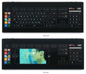
The touch display keyboard is an fascinating in that it works both as in input and output device, dynamically displaying information to the user. Basically the keyboard is a giant touch display which is fully customizable to fit the user's needs. One notable feature of the touch display keyboard are hot key tabs. For example if the user loads up Microsoft word the keyboard dynamically changes as the f1-f5 keys become Microsoft word's home, insert, page layout, ..etc tabs. If the user were to choose the insert tab on the keyboard keys on the keyboard would change accordingly into an image symbol, a chart symbol, or a wordart symbol. If the user is confused by one of these symbols all he/she has to do is lightly touch the key and a tooltip will appear, explaining the key's function.
The touch display keyboard is an fascinating in that it works both as in input and output device, dynamically displaying information to the user. Basically the keyboard is a giant touch display which is fully customizable to fit the user's needs. One notable feature of the touch display keyboard are hot key tabs. For example if the user loads up Microsoft word the keyboard dynamically changes as the f1-f5 keys become Microsoft word's home, insert, page layout, ..etc tabs. If the user were to choose the insert tab on the keyboard keys on the keyboard would change accordingly into an image symbol, a chart symbol, or a wordart symbol. If the user is confused by one of these symbols all he/she has to do is lightly touch the key and a tooltip will appear, explaining the key's function.
 |
| Optimus Tactus Keyboard |
A fair question to ask after learning of the hot key function is how would a user type normally when all the keys are in hot key mode. The touch display keyboard dynamically adjusts to the presence of both hands, meaning that the keyboard switches to QWERTY mode as soon as the user rests both hands on the keyboard. To simplify the keyboard's hot key capabilities a user can simply drag a function from a program with a mouse onto keyboard and that key will be assigned to the function. The functionality of this keyboard is truly amazing but currently only a prototype is available. For a full demonstration of the keyboards features on a working prototype see:
Saturday, September 18, 2010
Samsung Alias 2 Keyboard
The samsung alias 2 is actually a pretty cool flip phone that verizon has been offering for a little over a year. One of the main highlights of this phone is its keyboard that uses e-ink technology. As shown in the picture the phone can be opened lengthwise, revealing a full QWERTY keyboard or vertically, exposing a standard telephone keypad for phone calls.
My only complaint with the phone is that the send button is tiny and located to the left of the clr and end buttons, making it easy to accidentally press the wrong button.
 |
| Samsung Alias 2 SCH-U750 |
Sunday, September 12, 2010
Keyboards
One thing that has always brothered me is the layout of my laptop's keyboard. As shown in the photo there's not one but two backslash keys in close proximity. It just confounds me because I can't imagine why you would ever need two backslash keys on the right side of the keyboard.
 |
MSI GX630 |
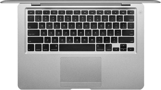
The only explanation I can think of is that the designers were so insistent about a perfectly rectangular keyboard design so they just tossed a random backslash key in order to fill in a void. Also as a result of the rectangular design the right shift key is tiny putting it at odds with pretty much every laptop keyboard in the last decade. For reference here's some other laptop keyboards:
 |
Sony PCG-FR415M |
 |
MacBook Air |
 |
Sony VAIO S260 |
Subscribe to:
Comments (Atom)

